1. Introduction
In order to practice our skills with the latest version of TFS 11 and VS 11, I decided to reverse engineer rapidly the standard Microsoft Fabrikam Fiber project.
Because I am a big fan of NDepend (often used as quality and technical audit tool), I will use this tool to understand more about Fabrikam Fiber project.
Usually, I use NDepend along a Software Factory as a quality gate on the top of FxCop and StyleCop (Vincent Labatut has got a CodePlex project to integrate easily NDepend to TFS 2010's Build definition).
2. Presentation of Fabrikam Fiber
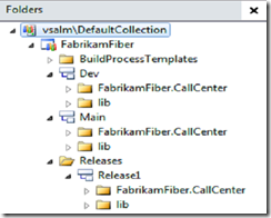
In the context of TFS 11 and VS 11 usage, Fabrikam Fiber is a Microsoft Web Project that to be a pseudo real case projec. As such it allows us to understand new concepts and practice ALM 11 tutorials. The source code is split accross 3 branches in TFS 11 : Main / Dev / Release1
 |  |
3. How is it organized ?
It's where NDepend comes into play. It will help us not only reverse engineer quickly the solution, but it will also present Microsoft's Best Practices coding conventions.
To enable NDepend analysing your VS11 Solution just edit the version inside the *.SLN:
3.1 Overview of the solution
You'll be able to zoom in / out with NDepend, as well as move or edit the Dependency Graph below:
3.2 Investigating on specific elements
Moving the mouse over the main web project FabrikamFiber.Web,
Let’s have a look at the NUnit tests. To do so, I can use another view called “Dependency Matrix”, where I can see that there’s 2 members coupled between nunit.framework and the test project:
 | Then, I can drill down to have more details, and get another Dependency Diagram that explains me the various relationships. And finally drill down to the source code. |
4. Code Quality of the source code
Out of the 82 Code Metrix provided by default, I am presenting you one of them below. It concerns performance issue of type “Boxing/unboxing methods that should be avoided” (you could create as many metrics as you want to suit your needs, using CQL language). It shows potentially 27 Performance issues.
- Pan (1) : The CQL query along with some advices
- Pan (2) : Where this query is classified into the SQL Query Explorer (you could create your own entry)
- Pan (3) : The number of quality infringements that satisfies the query
- Pan (4) : The 27 quality infringements are graphically filled in blue. The entire fractal representing your entire solution (decomposed graphically into Assemblies, namespace, … and methods). On mouse over the blue rectangles, you have more details.
- Pan (5) : The 27 quality infringements listed
- Pan (6) : Details property
5. HTML report
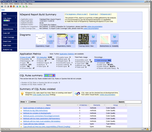
Here is an overview of the HTML report. Similarly to the “heavy” client, those reports are filled with plenty of help you understand various quality concepts.
I don’t know why, but the HTML report is the only way to visualize an interesting diagram “Abscractness versus Instability”.
This graph places all your assemblies into coloured zones and along 2 axis. From my experience, anything that does not fal into the green circled area should be considered as a pain to maintain. If an assembly falls into a red zone, you should fire the developer straight away !
Which mean this code’s implementation seams good from this diagram. Then we should double check with other indicators.
Since it is unfortunately a static PNG image, in large projects all assemblies are superimposed in the circled zone. Hence it becomes hard / impossible to read. As a result, I just use this graph as a trend indicator. Assembly in Orange or Red zone should be seldom, therefore you’ll be able to read its name.
Now I got a better idea of what this project is about, I can deep dive into the source code, and coming back and forth to NDepend, then drill down to the code again.


